
Alexander Hayes
Creative Director
SELECTED BRAND & IDENTITY WORK
A Pride brand built to flex
Trinity Pride
Branding, Creative Direction, Photography
Fort Worth, TX
2024 - Present
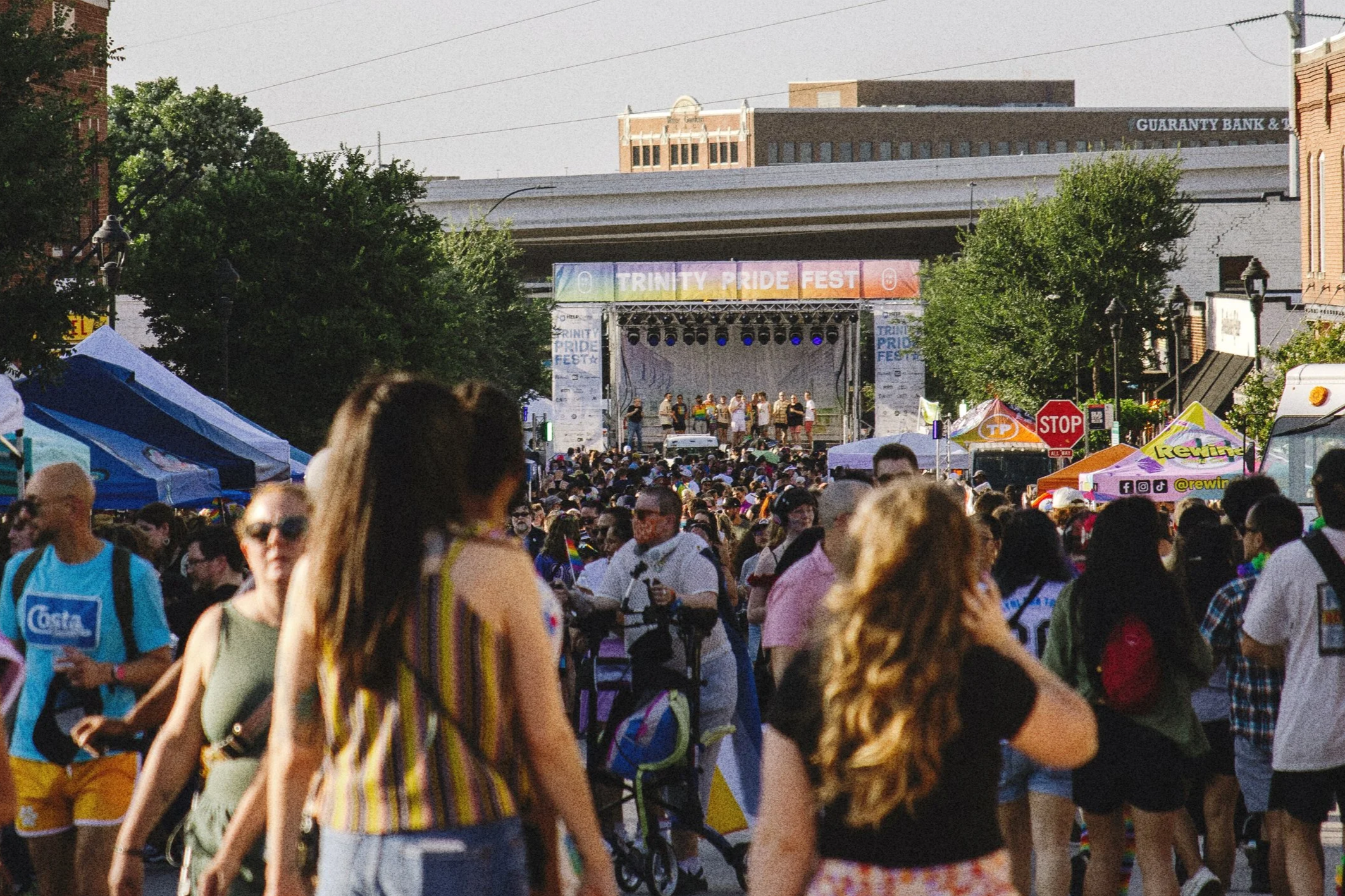
12,500 attendees · +42% YoY
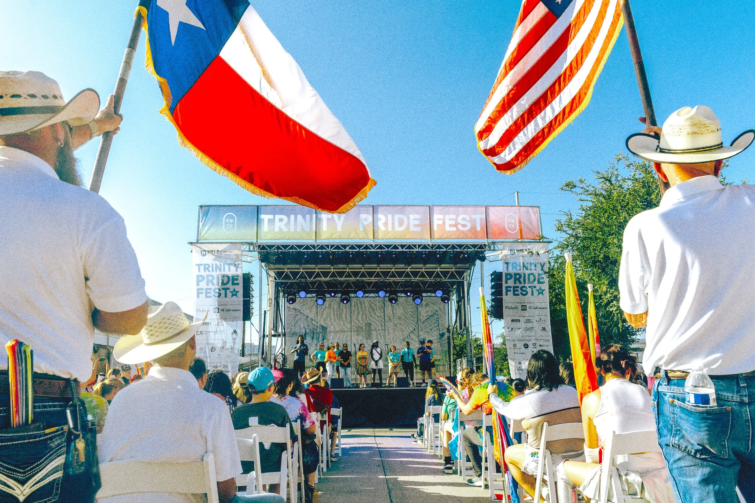
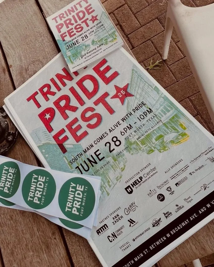
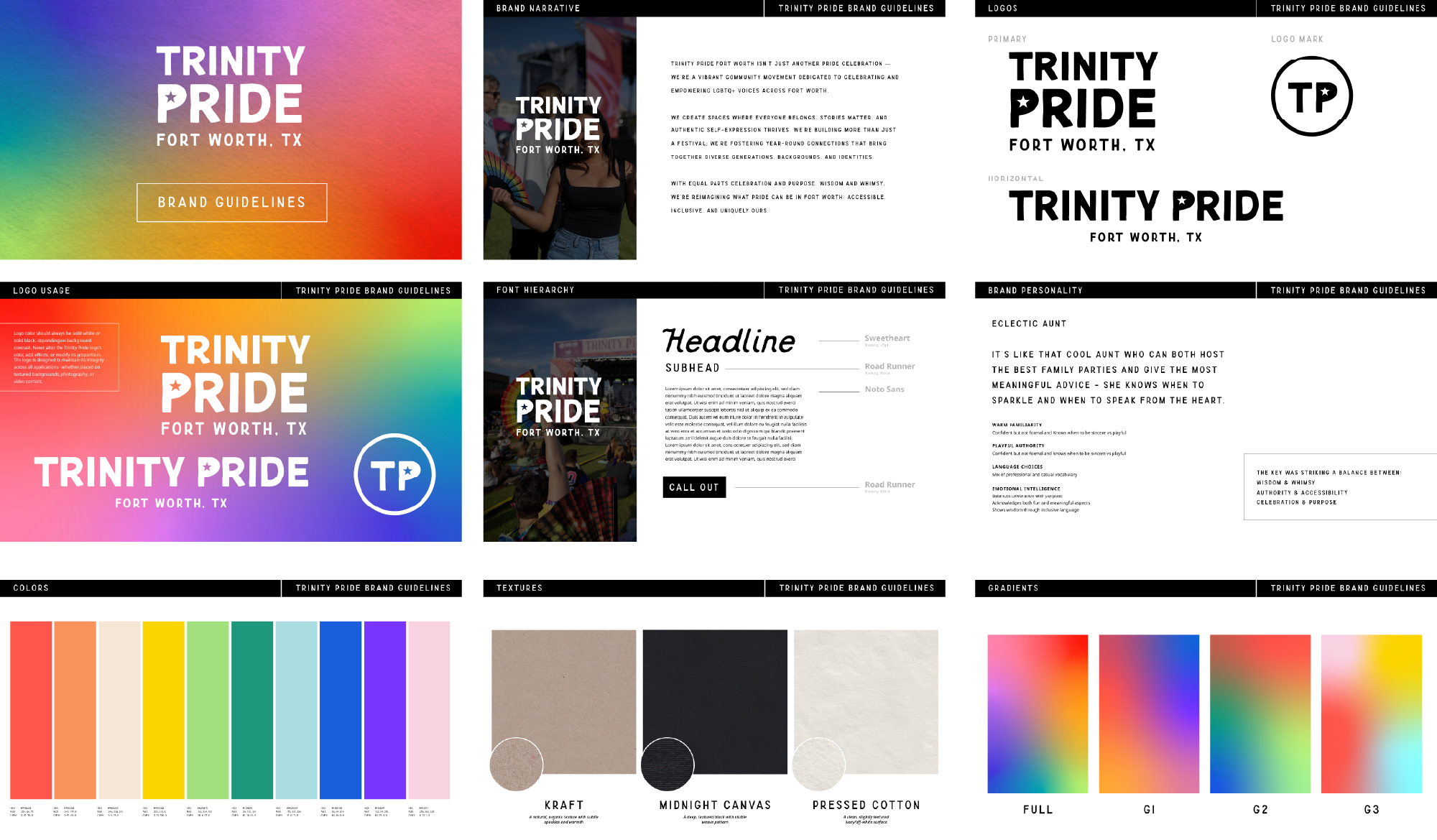
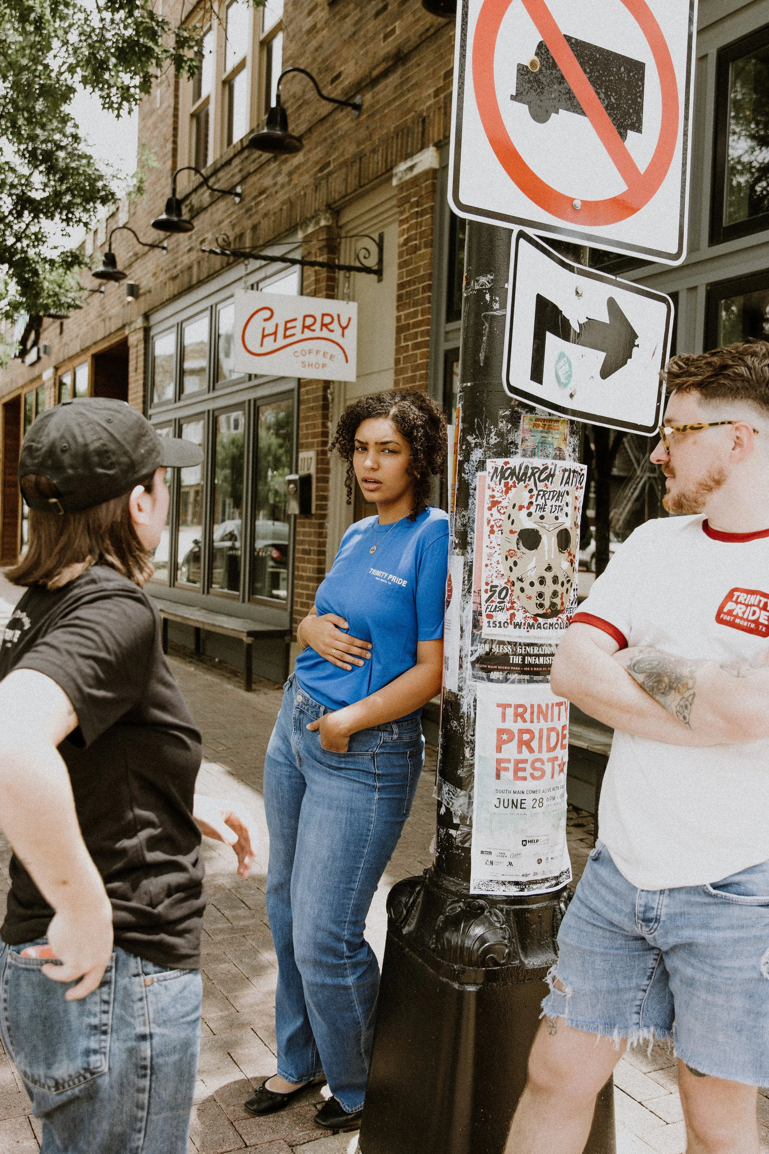
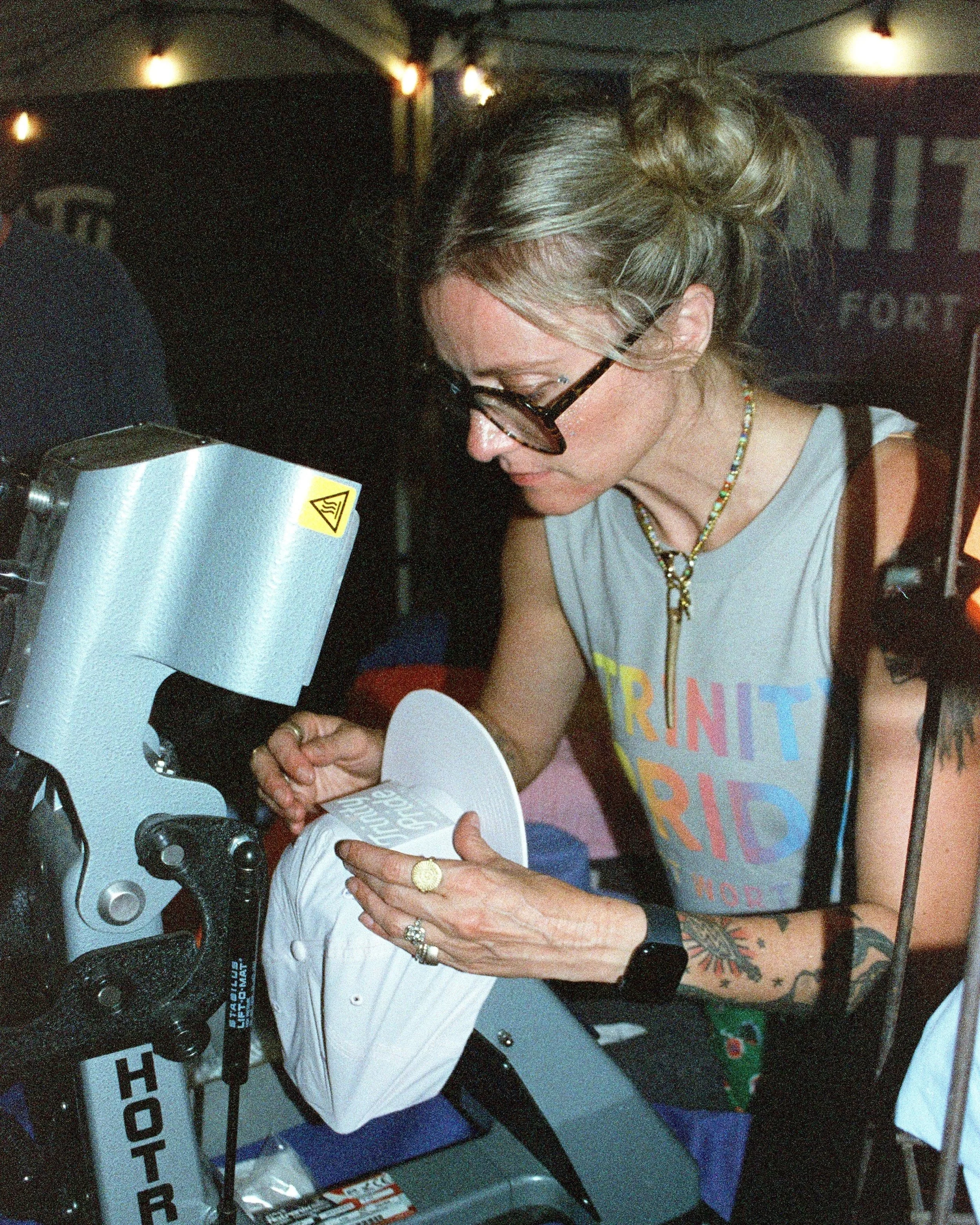
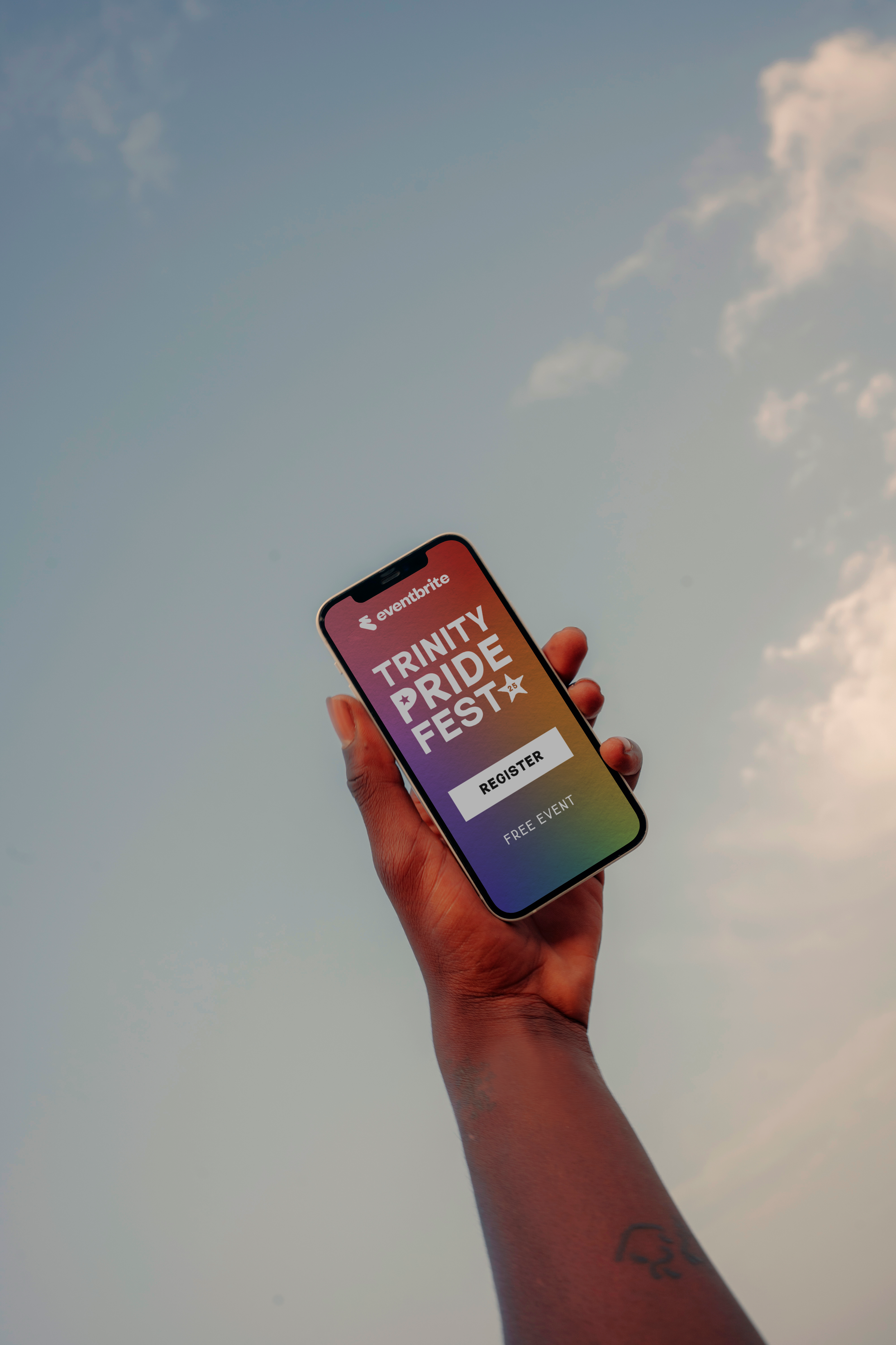
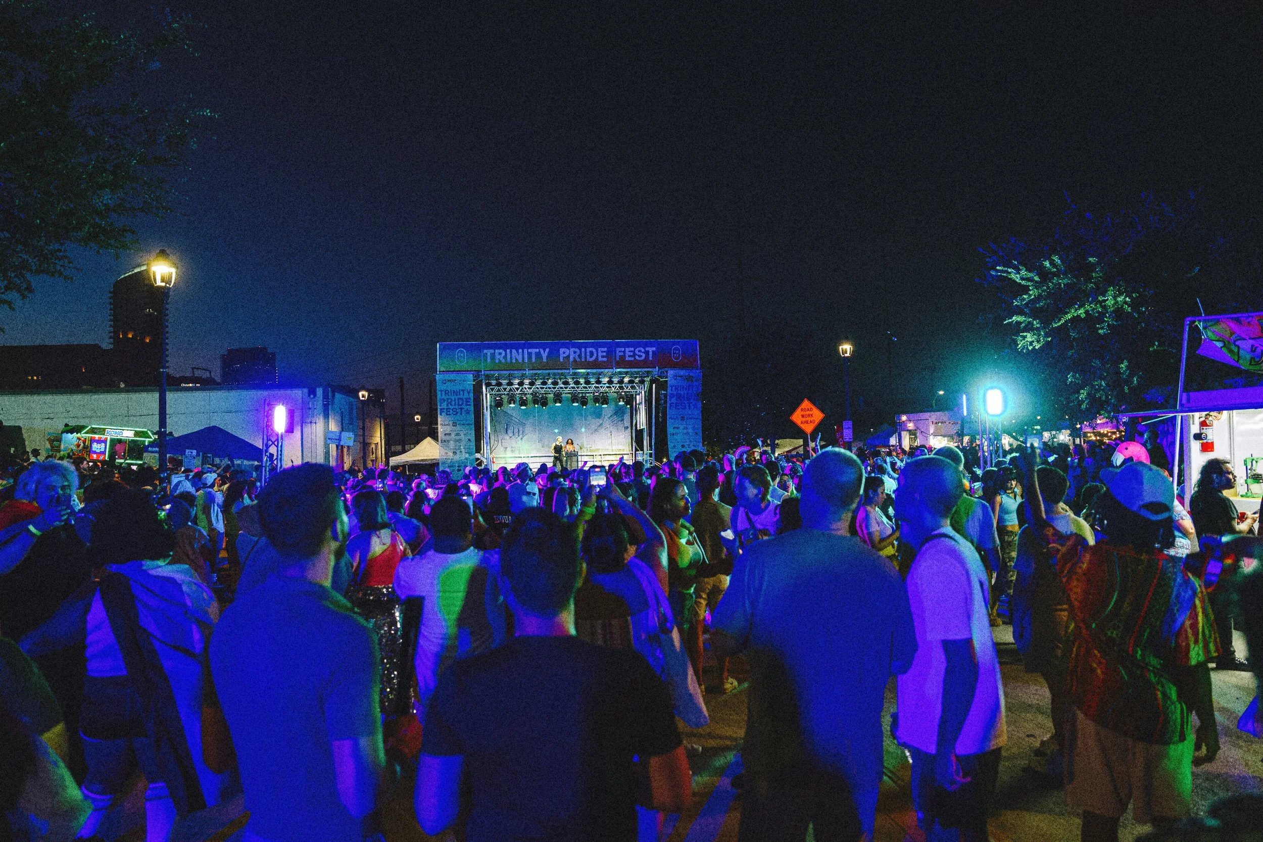
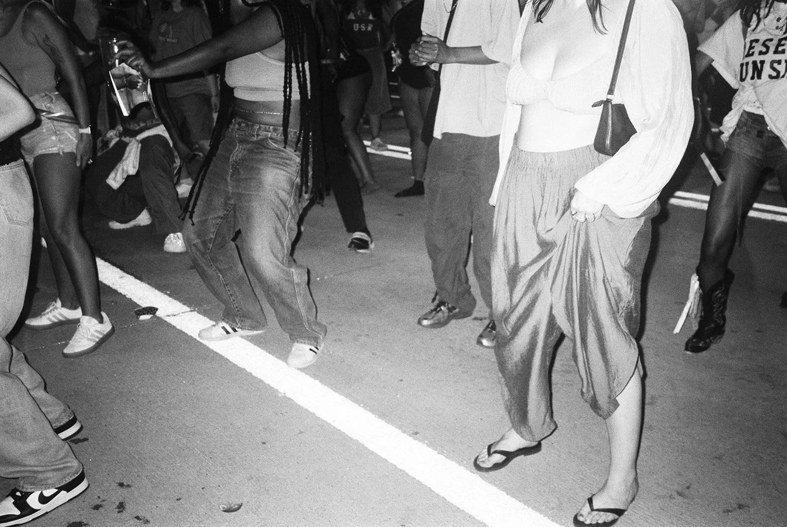
Fort Worth's LGBTQ+ Pride organization came to me with one outdated logo and no system. I rebuilt the brand from the ground up, bold and flexible, grounded in textured typography and a gradient that shifts across every application while staying unmistakably Trinity Pride.
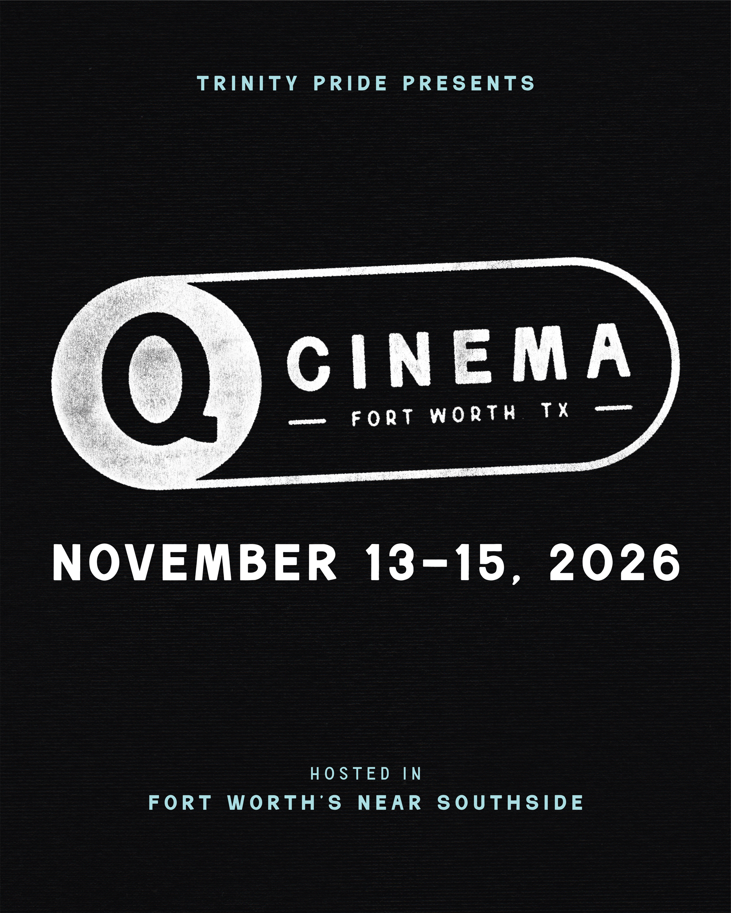
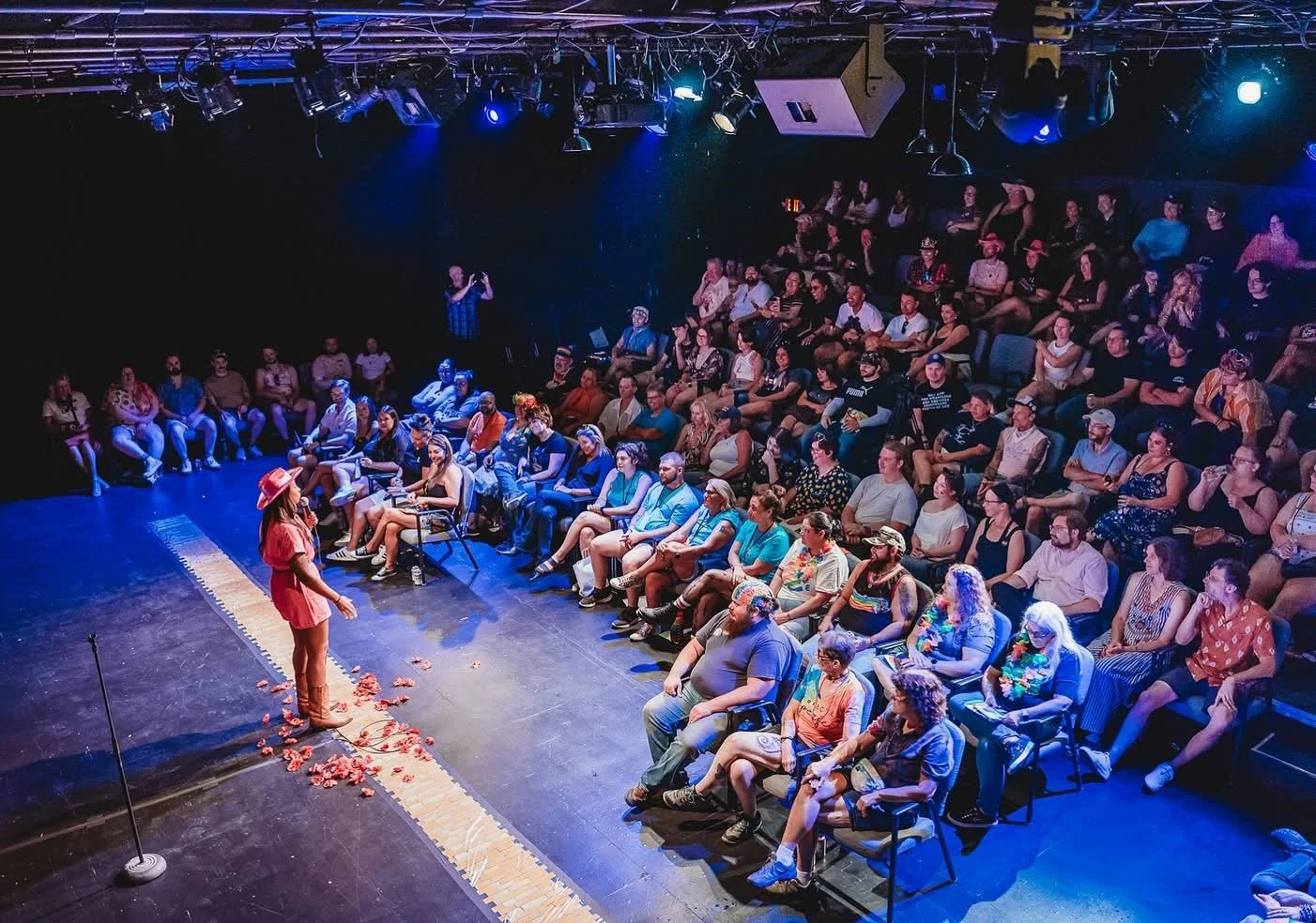
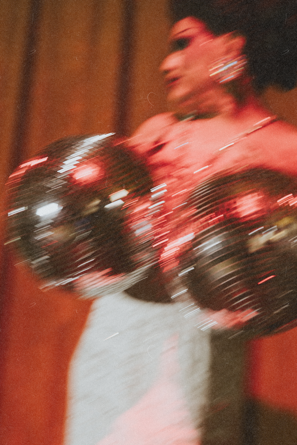
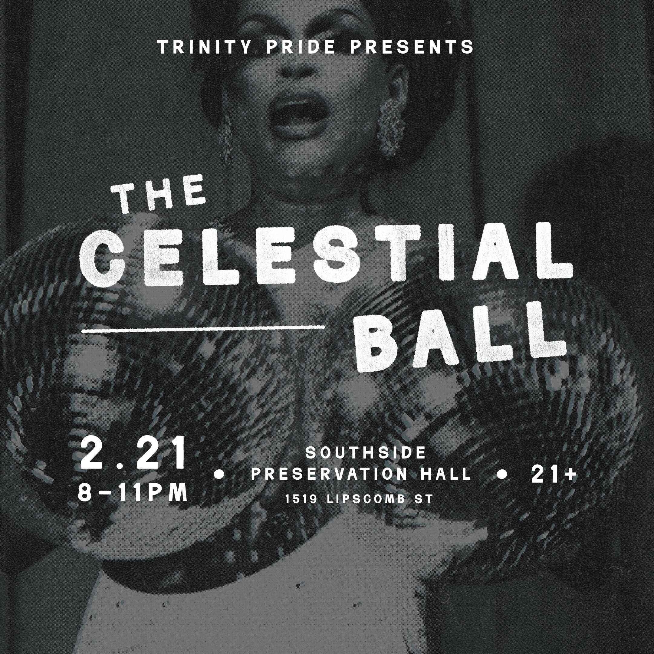
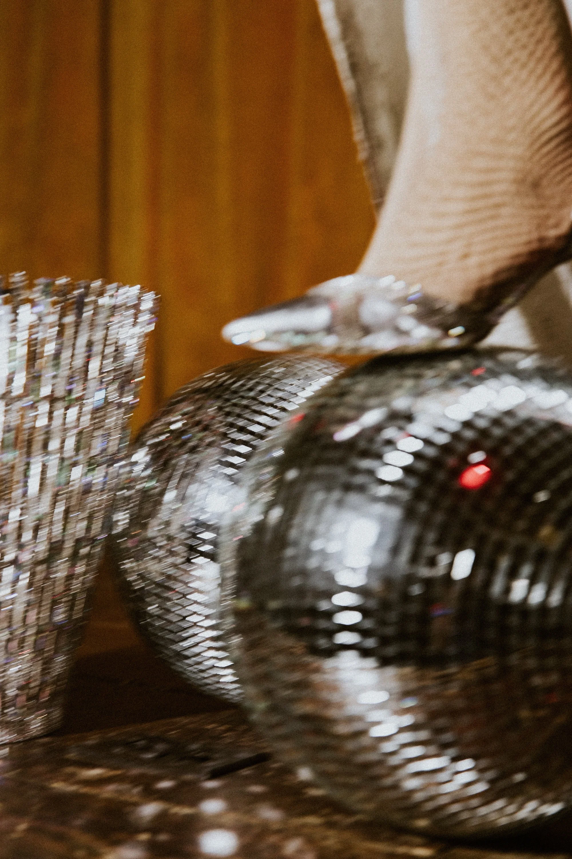
The identity spans visual identity, website, social systems, festival signage, sponsorship, and merch, and it's since extended into two sub-brands, the Celestial Ball gala (sold out in year one) and Q Cinema, a historic queer film festival relaunched under the Trinity Pride umbrella. Each has its own personality inside one cohesive system. In June 2026, Trinity Pride Fest drew an estimated 12,500 people, up about 42% year over year.
Trinity Pride
Trademark
Sounding Stone Farm
PDG
Brand systems at scale
Trademark Property Company
Branding, Creative Direction, Design Systems
Fort Worth, TX
2017 - 2024
76.6% media coverage YoY,
100% occupancy at WestBend
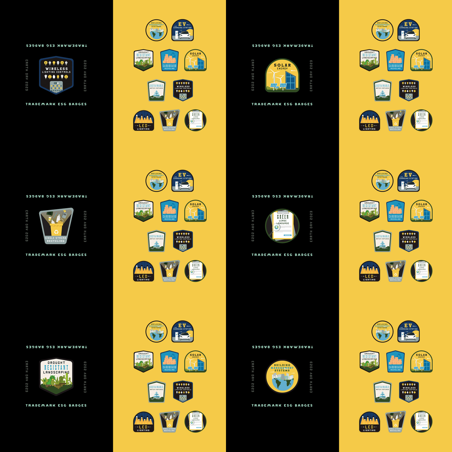
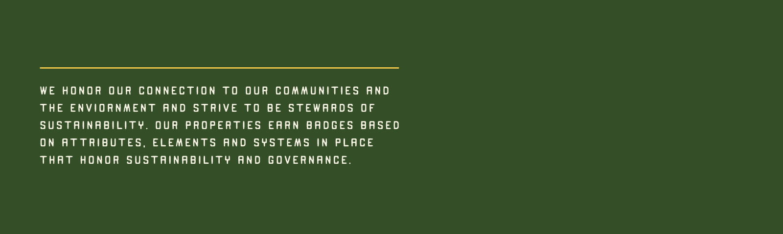
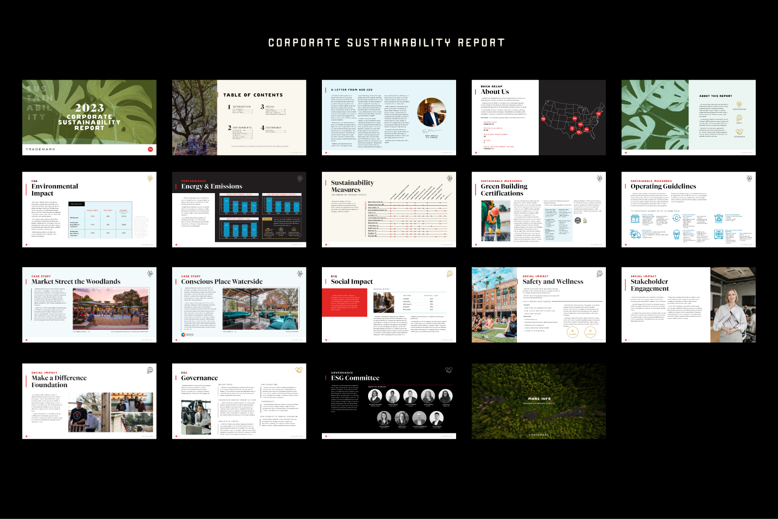
Trademark is a commercial real estate developer building community-driven spaces coast to coast, each property its own brand with its own audience. Leading creative there, my job was to make many brands feel like one company. I built the systems, templates, guidelines, and a customizable sustainability-badge program, that let every property stay uniquely Trademark.
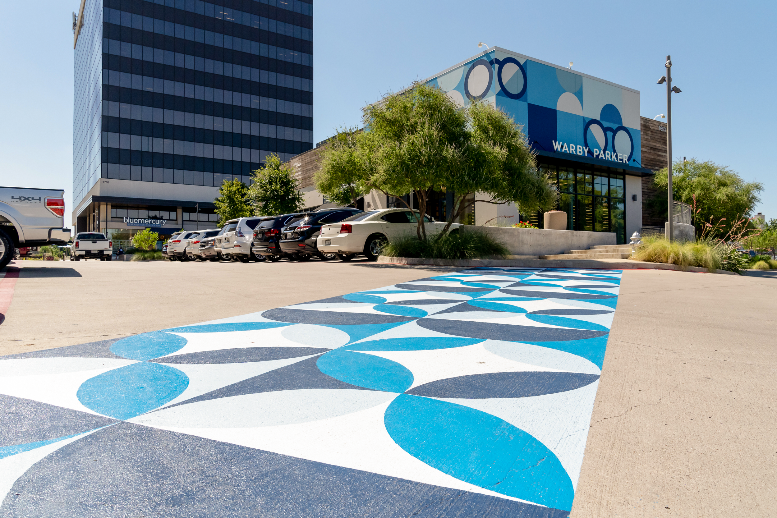
The work ranged from the firm's first Sustainability Report to placemaking like the Warby Parker crosswalk at WestBend to full property rebrands such as North Point Mall, which drew stronger tenants and new investment. Different audiences, different formats, one coherent system, and a refresh that lifted media coverage 76.6% year over year.
Trinity Pride
Trademark
Sounding Stone Farm
PDG



Grown from the ground up
Sounding Stone Farm
Branding, Packaging, Web Design
Joelton, TN
2021
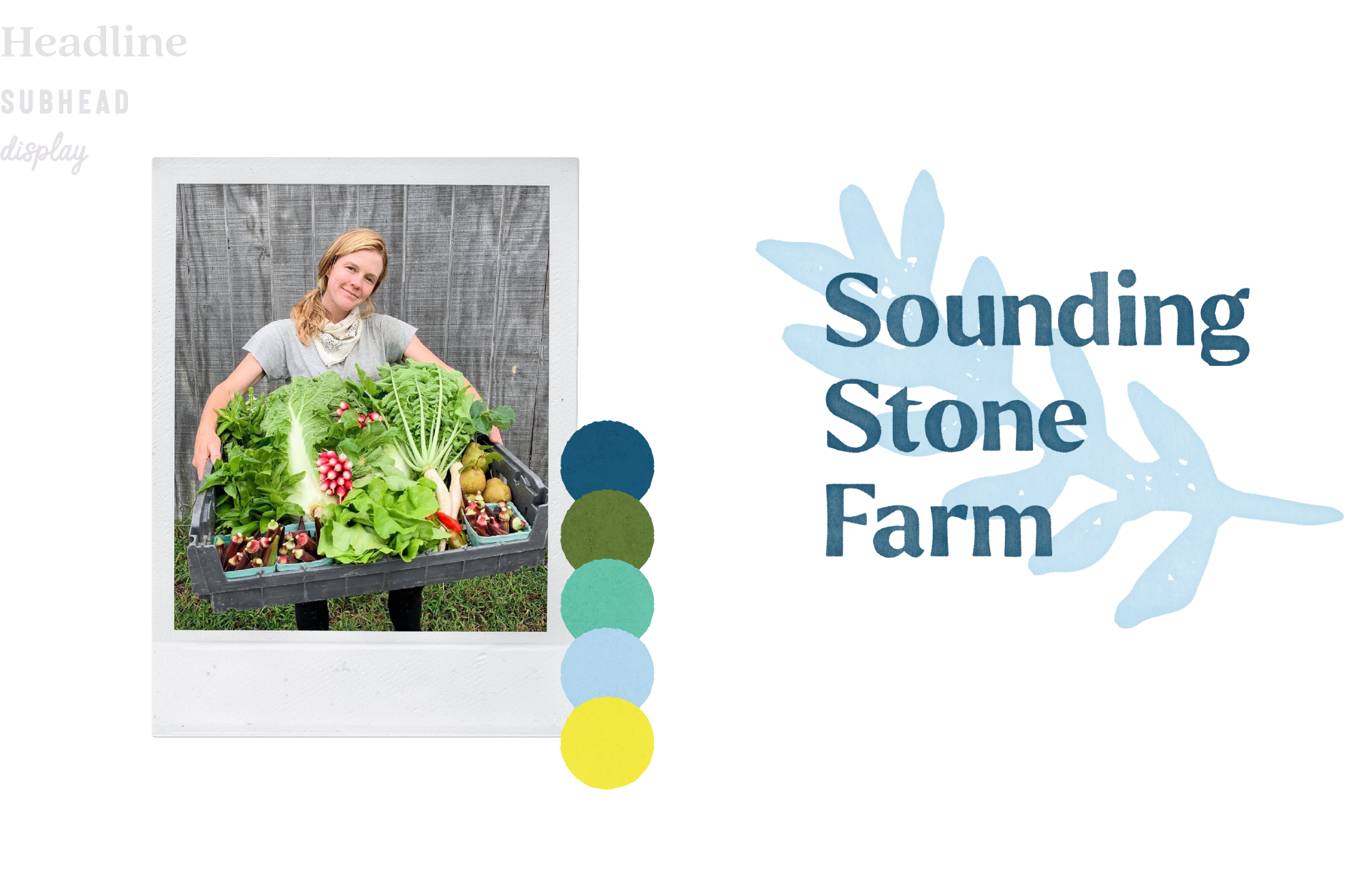
Sounding Stone Farm grows organic produce and was launching a CBD line, and needed one identity that could carry both without feeling like two companies. I built the brand from the narrative up, the identity, packaging, and website, plus the guidelines that keep it consistent as the farm grows.
It's a warm, grounded system rooted in authenticity and craft, at home on a crate of produce or a CBD label, and it gives a small operation the presence of a brand ready to scale.
Trinity Pride
Trademark
Sounding Stone Farm
PDG


Refined, not reinvented
Pross Design Group
Branding, Creative Direction
Dallas, TX
2023 - 2024
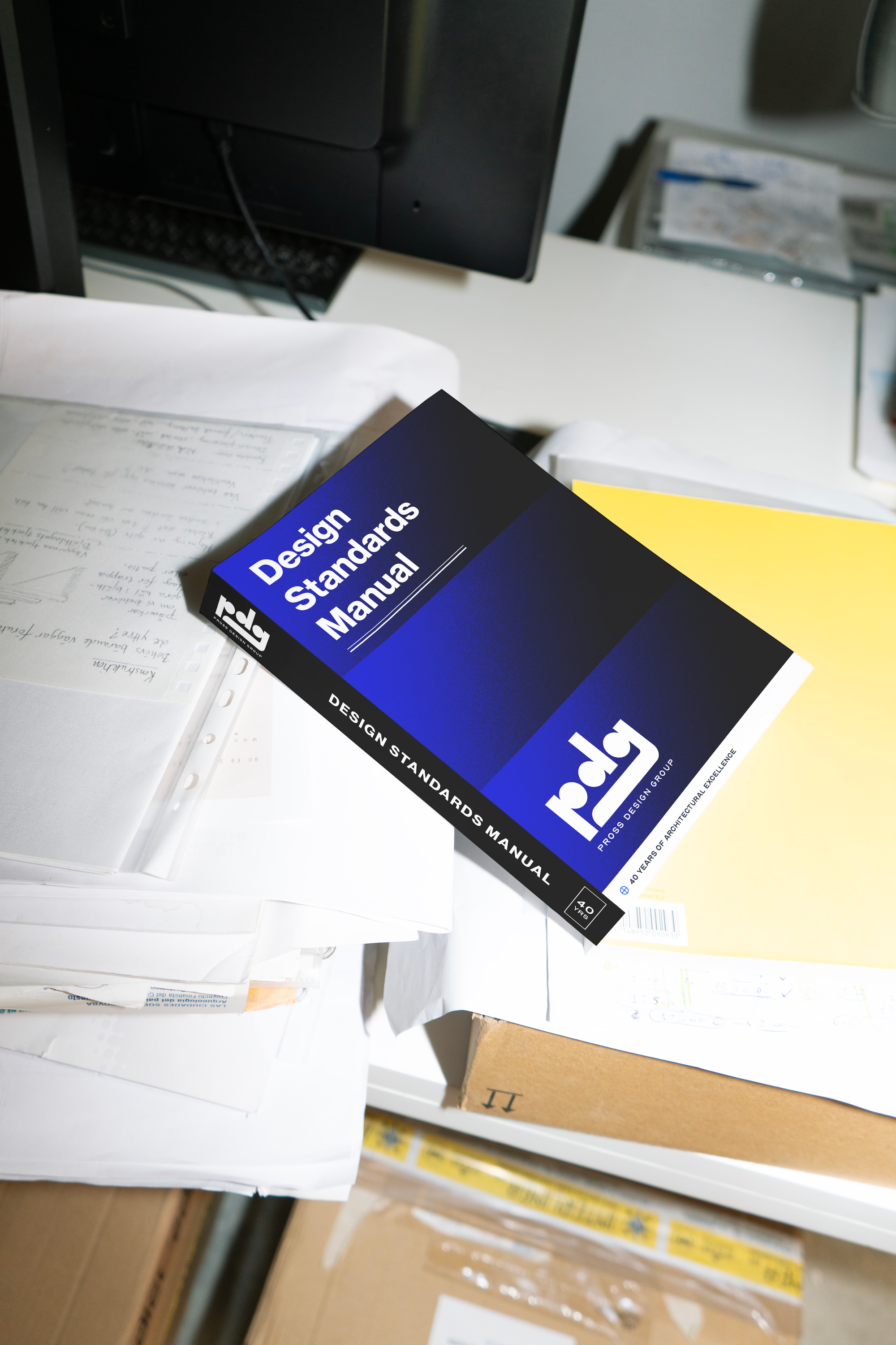
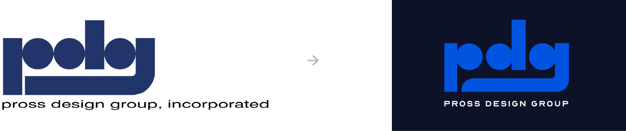
Pross Design Group is an architecture firm whose work had outpaced its existing brand. Instead of a complete rebrand, I led a targeted update, refining the logo and developing a comprehensive identity system that feels modern and thoughtful while remaining true to Pross. The system uses clean, geometrical typography and a restrained palette to reflect the firm's precision. The result is a polished, consistent identity that supports the firm across digital platforms, signage, proposals, and print.

You scrolled the whole thing.
We should talk.
I love this stuff: the big idea, the tiny details, and the people who care enough to get them right. If you're building something that could use a hand and a perspective, let's talk.
-Alexander